Top 5 Me-Site Makers, Part 2: About.me
 Welcome back! In my last post in this series examining the Top Five “Me-Site” platforms, we looked at Option #1, AKA Flavors.me. Today, we’re looking at About.me, and, believe me, they give Flavors a real run for their money. But before we tackle About.me, how did Flavors sit with you? Like it? Still pondering? Unmoved? Hungry for more options? All good because we’re far from finished here! But before we move on to About.me, here (below) is a graphical refresher on Flavors for anyone who might need it — quick and dirty, the way we like it best:
Now that we’re all on the same page about Flavors, we can move on to anatomizing Option #2 which is… *insert suspense-building sound effect here*… About.me! This “Me Site” platform is also, incidentally, Flavors’ mortal enemy main competitor.
About.me was released in 2010, one year after its initial creation and two years after Flavors was created. A mere 4 days after the launch of About.me, it was snapped up by AOL for, purportedly, a lot and grew into the small empire it is now. This year in February, About.me was re-acquired by the original founders for a fraction of what AOL paid. During this roller coaster ride, the service has not only managed to give Flavors a run for its money but also business is booming and now we’ll see why….
Me Site Platform Option Two: About.me
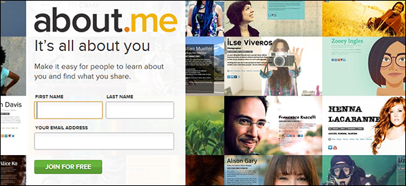
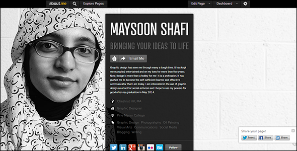
As soon as you visit About.me, it becomes immediately apparent that despite their rivalry, Flavors and About are uncannily similar with their identical domain suffixes, landing pages tiled with spiffy-looking splash pages, and simple sign-up processes. They also feel the same — professional, while being friendly and fun. Of course, that’s no crime — imitation is the highest form of flattery — and why mess with success? As it so happens, once we get past appearance, the similarities between Flavors.me and About.me become few and far between.
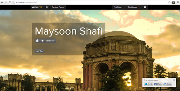
After a rapid sign-up process during which you supply your name, password and email address (all the usual stuff), you’re introduced to a lovely stock image, your name and… that’s pretty much it. But we’re pumped and ready to tinker.
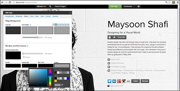
Clicking the Edit Page button in the website’s header brings up the interface used to interact with your page. A few edits in, and it’s immediately clear that About.me trumps its rival in the user experience department. The process is smooth and straightforward. There are 8 categories to explore and no excessive tabs to click through. Score 1 for About.me!
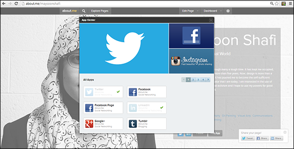
Score 2? Yes, indeed: There are 30 wonderful social media sites waiting to be incorporated (for free). If users wish to add sites like Pinterest that aren’t supported by About.me, the custom links option is there for you. You can even add your WordPress passion blog as a link and the site will automatically sync to display your most recent posts!
Unfortunately, About.me loses points in the looks department. It doesn’t have the number of layouts or 222 fonts its competitor brags about. But instead of fixating on what we don’t have, let’s focus on what we do: 34 fonts, multiple background patterns, background images and colors, colors, colors! With a little fumbling and some ingenuity on your part, your Me Site can be just as awesome as you are. For a little extra oomph try:
- Re-positioning your text and background image for optimum composition
- Re-sizing the width of your text box by altering the font size of your name and tagline
- Adjusting the opacity of your text box
- Clicking the Explore button to check out what others have come up with. …Remember, great artists steal! (But not literally, please.)
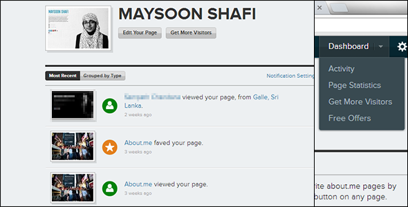
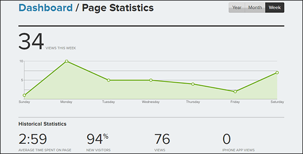
 The perks don’t end at the completion of your splash page. In your dashboard, you can click through to the Activities or Page Statistics to find out how well you’re doing. You can check out other About.me-ers who have viewed your page, and track visitors and clicks on your apps and links. In case it slipped your mind, that’s a feature Flavors.me asks you to PAY to get! Here at About.me, it’s all free! (Save that $20 for poppin’ some tags.)
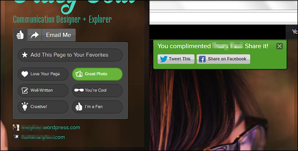
Aaand it just gets better because About.me is social. By adding tags to your profile describing your location, job, education and skills, you can find people who share your attributes and they, in turn, can find you. The site allows you to connect with these people by emailing them, adding their page to your favorites or complimenting them with things like “Love Your Page”, “Creative!” and “You’re Cool”. Not only is it just a nice thing to do, but it’ll keep ‘em coming back to check your Me-Site out as well.
 However, despite all of these advantages of About over Flavors, I chose Flavors for my own Me Site.
One of the main reasons I was swayed to choose Flavors.me was that About.me header that forever looms at the top of the page. I don’t want visitors to constantly be reminded that I was riding on the shirt tails of another service provider — that my page wasn’t really my page. For me, that reduction of authority reduces the professionalism of my Me Site page. If that doesn’t bother you, nor the limited choices in terms of customization, you’ll be in good and safe hands with About.me. It provides a variety of unique services and it’s ease of use make it hard to pass up. And all for the low price of … nothing!
It’s tantalizing deal.
Now you have two choices to mull over. *Insert maniacal laughter sound effect here*. Check out Option #3 soon… coming to a Degrees2Dreams near you….


